
Last modified: 2026-01-02 by daniel rentería
Keywords: venezuela | ministries |
Links: FOTW homepage |
search |
disclaimer and copyright |
write us |
mirrors
 images by Daniel Rentería, 14 December 2025
photo from mazo4f.com
See also:
The new flag, as adopted in 2025 alongside its logo, is simple: the logo depicts three wavy bands in the style of the Venezuelan Flag with its stars in the center.
Underneath is REPÚBLICA BOLIVARIANA DE VENEZUELA; dividing the logo is a thin bar to the right, after which text reads Ministerio del Poder Popular para Relaciones Interiores, Justicia y Paz.
Esteban Rivera, 13 November 2025
.gif) logo from mpprijp.gob.ve located by Esteban Rivera (13 Nov 2025)
logo from mpprijp.gob.ve located by Esteban Rivera (13 Nov 2025)
 images by Ivan Sache, 16 May 2021
"The Ministry of the Popular Power for Interior, Justice and Peace
(Ministerio del Poder Popular para Relaciones Interiores, Justicia y Paz in
Spanish) is an executive body of the Venezuelan government. It traces its
origins as far back as 1832. With the promulgation of the Constitution of the
Bolivarian Republic of Venezuela in 1999, the Ministry of Interior and the
Ministry of Justice were merged to form the Ministry of the Interior and
Justice, renamed in 2007 to Ministry of the Popular Power for Interior and
Justice. Jesse Chacón, Minister of Justice, declared in 2004 that the Ministry
of Justice would be renamed to Ministry of Interior Policy and Security. In
2013, President Nicolás Maduro announced that the ministry was renamed to
Ministry of Interior, Justice and Peace."
Source:
https://en.wikipedia.org/wiki/Ministry_of_Interior,_Justice_and_Peace and
https://es.wikipedia.org/wiki/Ministerio_del_Poder_Popular_para_Relaciones_Interiores,_Justicia_y_Paz
Its flag is a white horizontal flag with the
logo in the middle, as seen
here (flag on the right)
Source:
http://linkis.com/www.aporrea.org/Q5N1s
For additional information go to official
website.
Esteban Rivera, 18 April 2016
Photos
https://www.facebook.com/MPPRIJP/photos
https://www.facebook.com/MPPRIJP/photos
http://radiomiraflores.net.ve
https://www.radioreloj.cu/
Ivan Sache, 16 May 2021
The "Cuerpo Tecnico de Polici'a Judicial" (CTPJ) is the national investigative police in Venezuela, closely linked to the Judicial Power and to the whole procces of enforcing Penal Law. It has two flags, a flag for the Central Office and representative of the institution itself, and a branch flag (not official, only drawn from my observations).
 image by Guillermo T. Aveledo, 1 March 2000
The CTPJ Flag consists of a sky blue field represents marian (after Virgin Mary, of the Catholic faith) and the white cross (of Jerusalem) represests devotion and the spirit of sacrifice which must caracterise and be a mark of every man and woman belonging to the CTPJ. On the center of the cross, we see the CPTJ's Coat of Arms:
 image by Guillermo T. Aveledo, 1 March 2000
The Coat of Arms - sabre fielded shield, as a symbol of hte
impetuosity of police soul. It is not a parted field (symbolising
the unity of the police body and the competence of the STPJ all
over the Venezuelan Territory). A quartered golden cross sits at
the center of the shield, and from its centre, golden rays gleam
to the different extremes of the cross (and of the four smalle
crosses annexed to it, representing honesty, heroism, loyalty and
total surrender of the self to virtue). Crowning the whield we
see a mural crown (similar to those on Portuguese municipal flags
and to that of Venezuela's National Guard), with four turrets,
simbolising the reward for the bravery, the boldness and the
perseverance which are kry to the triumph of good over evil.
Below, we there's a flying eagle, as a symbol of the
sagaciousness and firmness necessary in the pursue of police
duties, to subdue evildoers. The two lauril branches along the
seides of the shield incarnate the hopes on achieving goals and
the reward for heroic action. Finally, encricling the shield, we
see a band with marina colours (blue-white), which identify
the CTPJ. We see on this band the date of foundation of the CTPJ
(February 20th, 1958), and the date of the passing of the Law onf
Judicial Police, (July 8th, 1975). From left to right and hugging
the lauril branches we can read the phrase "Non ministrare,
Sed ministrare" (Not to be served but to serve).
Guillermo T. Aveledo , 1 March 2000
I located this flag but as National Direction of Penal
Investigations at <www.ctpj.gov.ve>.
Here is a Altavista translation:
FLAG - It is the standard that represents the honor and the
highest values of the National Direction of Penal Investigations.
The celestial blue bottom incarnates the marianos colors and the
white cross means the devotion and the spirit of sacrifice that
must characterize and distinguish all man and woman whom part of
the Institution forms. The own and exclusive character of the
National Direction of Penal Investigations, is identified when
taking the Shield of Arms in the central part of the Flag
totally.
The Shield of Arms has a bottom field, color saber (black), that
it wants to symbolize reciedumbre of the Police Core. This field
is not divided nor is divided, thus wanting to symbolize the unit
of the Body and the Police competition that the Venezuelan
national territory has mainly. In the center of this field, it
goes like figure, a cantonada enamel cross metal gold, formed by
a great Greek cross. There from the center of the great cross
they leave to rays for the ends, also covering other four small
inserted Greek crossings. The cantonada cross is one of oldest
than it is known in the Christian world. It is a sacred symbol.
With her it is wanted to represent the heroic acts inspired by
the search of an ideal, without repairing in difficulties nor
sacrifices, separating all idea from profit and personal
interest, the sacrifice and the honor of the police civil
employee. The four small crossings mean the virtues of the
heroísmo, loyalty, the honesty and the total delivery to the
service. In the superior part it is the crown mural, that
symbolizes the glory, the prize to I throw, the value and
certainty that determine the triumph of the good in the fight
against badly. In the inferior part it is the rampante eagle
symbolizing the necessary sagacidad and the firmness in the
fulfillment of having police officer, to reduce to the
malefactors. The two branches of laurel of the flanks incarnate
the hope in the profits and the prize to the heroic actions.
Finally, bordering the shield, a tape with the marianos colors is
seen, blue and white that identify our Institution. In her we can
read the date of the foundation of the National Direction of
Penal Investigations: 20 of February of 1958 and the date in
which the Law of Judicial Police was promulgated: 8 of Julio of
1975. Of right to left and more down, it is reflxed mng in Latin
" Non Ministrari, Thirst Ministrare ", that in Spanish
means: Not to be served but to serve, motto that must at any
moment have the police civil employee like north of its acts.
"
Dov Gutterman, 21 January 2002
The National Direction of Penal Investigations was formerly
known as the CTPJ or Cuerpo Tecnico de Policia Judicial
(Technical Body of Judicial Police). I'm sure the CoA will have
to change (since it says Cuerpo Tecnico de Policia Judicial in
the white-blue band encricling the shield).
The NDPI changed from the former CPTJ late in 2001. I was
expecting a thorough symbol change, but nothing has happened so
far.
Guillermo T. Aveledo, 5 March 2002
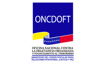 image by Daniel Rentería, 14 December 2025
photo from noticierovenevision.com; located
by Esteban Rivera (13 Nov 2025)
The "Oficina Nacional Contra la Delincuencia Organizada y Financiamiento al Terrorismo", ONCDOFT) or National Office Against Organized Crime and Terrorism Financing
was established by Decree N° 4.806 published in the Oficial Gazette N° 38.522 of 14 September 2006; originally as "Oficina Nacional Contra la Delincuencia Organizada, ONCDO",
only including the organized crime part of its name, as an entity attached to the then Ministry of the Interior and Justice.
Then it adopts its current denomination in 2012 with the enactment of the Organic Law Against Organized Crime and Terrorism Financing, published in the Official Gazette N° 39.912,
which created the current ONCODFT as attached to the Popular Ministry of Power for Interior Relations, Justice, and Peace..
Sources: [1] and [2].
Esteban Rivera, 13 November 2025
.gif) logo from Facebook; located
by Esteban Rivera (13 Nov 2025)
logo from Facebook; located
by Esteban Rivera (13 Nov 2025)
The logo is a square, divided by a wavy 3D band having gray as its shadow in the National Colors inclduing the stars; over the square reading ONCDOFT. Underneath all of this, it reads OFICINA
NACIONAL CONTRA DELICUENCIA ORGANIZADA Y FINANCIAMIENTO AL TERRORISMO with a bar underneath; under this as the full version, it reads MINISTERIO DEL PODER POPULAR PARA RELACIONES INTERIORES, JUSTICIA Y PAZ
the Ministry it is a part of.
[Editor]
Anything below this line was not added by the editor of this page.